The Airbrushed Irreverence of Harumi Yamaguchi
February 2022
Harumi Yamaguchi’s most iconic works – the airbrushed ‘Harumi Gals’ of the 1970s and 1980s – are all surface. In their irreverent superficiality, they represent, and more importantly helped to shape, the crystalline aesthetic of bubble-era Japan. This was a time when the Marxist poet and critic Takaaki Yoshimoto embraced high-concept consumerism – as represented by Rei Kawakubo’s Comme des Garçons label and composer Ryuichi Sakamoto’s first solo album Thousand Knives (1978), which featured a detailed credit of the musician’s outfit on the back cover (jacket by Giorgio Armani, shoes by Manolo Blahnik).

Born in 1936 in Shimane Prefecture, Yamaguchi launched her signature protagonists in 1972 while working in the all-female advertising division of the department store chain, PARCO. Founded three years earlier , PARCO presciently identified, then helped develop, the Tokyo neighborhood of Shibuya as a new commercial district targeting the young. Yamaguchi studied alongside key conceptual artists such as Jiro Takamatsu at the esteemed Tokyo University of Arts, where she discovered the work of Jean Dubuffet, which, she claimed, influenced her. She found the academic environment ‘depressing,’ abandoned her oil painting, and was relieved to identify an alternative path in an exhibition she saw in the summer of 1958, staged by the Japan Advertising Artists Club.
In 1978, Harumi Gals, a book compiling Yamaguchi’s airbrushed illustrations of women, was published by PARCO to great acclaim. Art-directed by the graphic designer-turned-painter Tadanori Yokoo, the book’s formidable list of contributing authors – the modernist graphic designer Ikko Tanaka, photographer Hajime Sawatari, and novelist Junnosuke Yoshiyuki among them – is a testament to the seriousness with which PARCO treated the work.
The image of the beautiful woman is intimately tied to the history of advertising and department stores in Japan, as indeed in much of the rest of the world. In 1907, Mitsukoshi department store employed Saburosuke Okada’s photorealist renderings of women, which upheld the era’s conventional beauty standards, in order to address and define the modern female consumer. Much the same could be said of Yamaguchi’s role at PARCO. She explains that her purpose was: ‘To target energetic young women [by] illustrating contemporary pinup girls that represent the Pop woman.’ A new woman was needed for the late 20th century and the Harumi Gals personified unapologetic poise and dynamism.
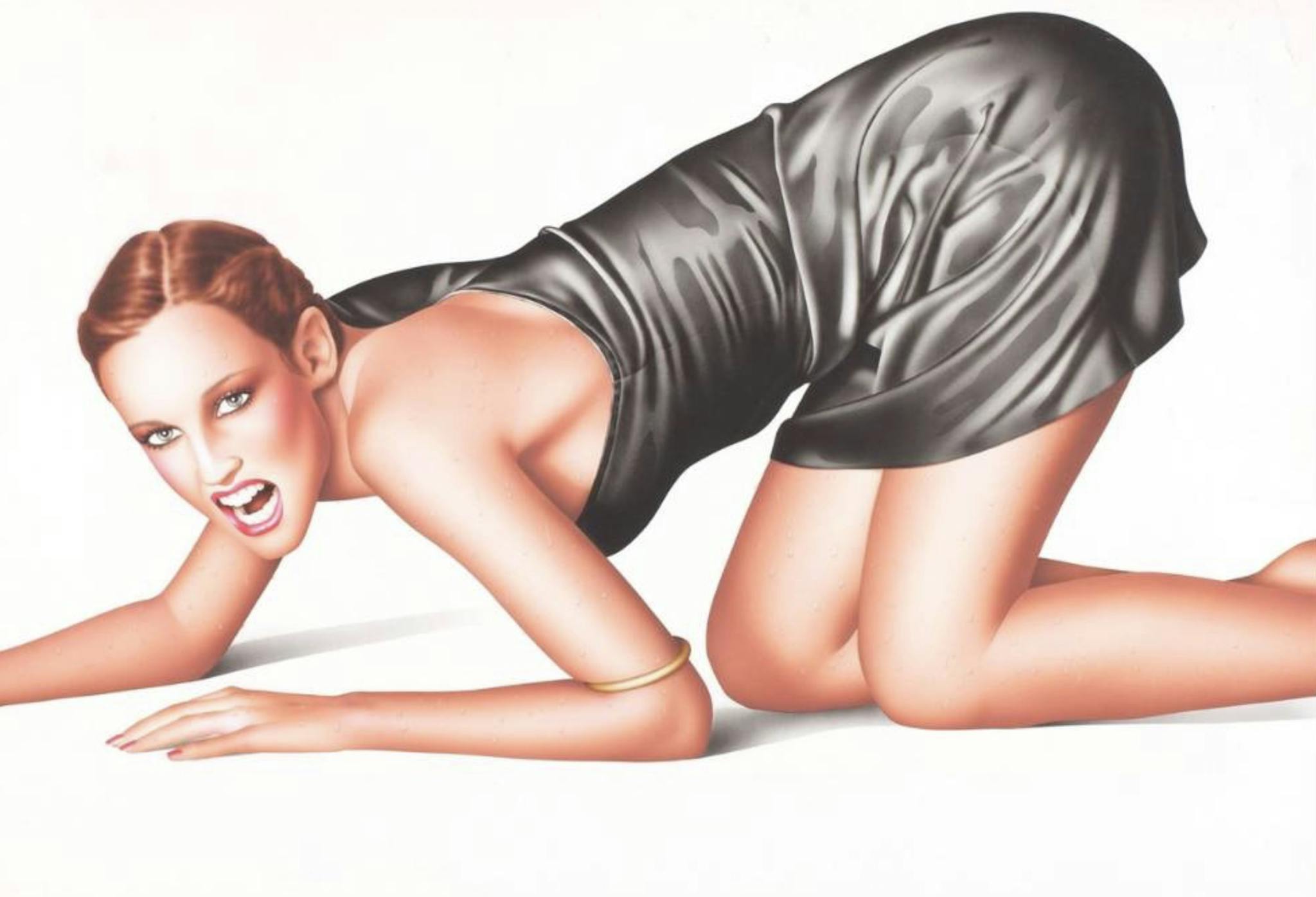
Harumi Gals play ball, roller-skate, skateboard, swim, and eat, displaying all the confidence and freedom of the cover girls found on mid-1970s Lui, France’s answer to Playboy. The Harumi Gal emanated agency and autonomy – characteristics rarely seen in commercial depictions of women in Japan in the 1970s. Within the Japanese context, she appeared remarkably unabashed and, since her rise coincided with that of the women’s liberation movement, she has been popularly assessed as a representation of unfettered freedom and empowerment. Her apparent strength also made her a formidable marketing tool for PARCO.
In the 1980s, as the Japanese economy became the second largest contributor to global economic growth, PARCO took an innovative approach. Its promotional campaigns advertised a sensibility rather than actual commodities. The boundaries between culture and consumerism were pushed to their limits as PARCO aggressively promoted itself as a cultural institution, operating a theater that hosted ‘underground’ plays as well as contemporary classical music concerts, an art house cinema, a publishing house, art bookstores, and a record store. PARCO understood all the cultural products its various arms sold as ‘fashion items’ and Yamaguchi’s women were an integral part of this culture.
Typically dressed in ensembles of aqua, fuchsia, lemon, and lime, Yamaguchi’s figures strike poses, referencing American pinups that foregrounded the face and elongated the legs in unlikely compositions. Popularized in the pages of Esquire magazine between 1930s – 1950s, the American pinup was used to promote a variety of things – most notably to forge a link between consumerism and nationalism. Like their American predecessors, such as the Petty Girl and the Varga Girl, the Harumi Gals are almost exclusively white, and hence cannot stoke nationalism in their Japanese viewers. Instead, the Harumi Gals speak to the hegemony of American values and visual culture in postwar Japan, as well as to the emergence of a highly advanced consumer visual culture that replaced national aesthetics in the mainstream.
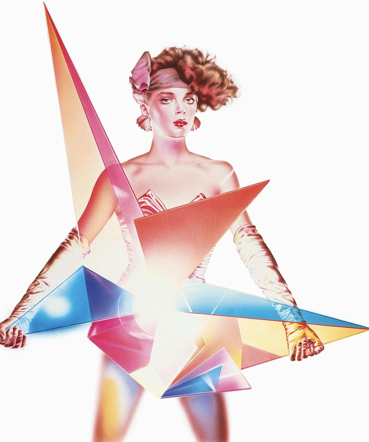
Like George Petty and Alberto Vargas, Yamaguchi’s signature medium is airbrush. It is uniquely suited to creating seamless layers of color and softened lines without brushmarks in order to achieve a photorealist effect. Harumi Gals float in space, complete but displaced – not only pinned up but also cut out. In contrast to their predecessors, candy colors are applied opaquely with minimal gradation. The flesh, too, is delineated quite harshly against the ground and is modeled only subtly compared to the work of Petty and Vargas, making the figures less voluptuous than their American counterparts. The exception is the hair that frames their glowing white faces; voluminous locks fall out of focus as they radiate outwards. The viewer is drawn in and met with sharply rendered eyes and lips. These fetishized faces stand for an idealized femininity, continuing classic Hollywood conventions, as seen in Josef von Sternberg’s paradigmatic treatments of Marlene Dietrich, one of the few named women also given the Harumi Gal treatment.
Provocatively ambivalent, Yamaguchi’s oeuvre troubles assumptions that commercial work is regressive while avant-garde work is progressive, particularly from the perspective of gender. She populated the commercial world with ‘independent women’ and aimed, she said, to ‘represent strong young women who, above all else, had attained freedom.’ In 1988, a decade after Harumi Gals was published, Yamaguchi created the ‘noyōni’ (similar to) poster series. For these she depicted historical female figures – ‘our seniors who lead the way to freedom’ – such as Virginia Woolf and Simone de Beauvoir. These portraits are gesturally painted in loose strokes in strong contrast to her previous work. The subjects of the series are also more racially diverse and include Black icons such as Billie Holiday and Josephine Baker, as well as Fusae Ichikawa, a leader of the Japanese women’s suffrage movement.
Asked about the increased attention her work has received more recently, at a time when the politics of gender and race have been pushed to the fore, Yamaguchi replied: ‘In the advertising images of the previous decades, all we saw were smiling beauties. Today, there are as many desired images of femininity as there are people.’ While DEI (Diversity, Equity, and Inclusion) now plays an important part in many marketing strategies, this wasn’t the case in Japan in 1988. That Yamaguchi’s noyōni posters foreshadowed and helped implement this shift cannot be ignored. In 2021, for example, Panasonic released commercials explicitly promoting diversity: one for a hairdryer showed people of various genders and ages, while another for a shaver included the drag queen Durian Lollobrigida.
After his first trip to Japan in 1986, the American writer Glenn O’Brien concluded in the pages of Artforum: ‘Our easy distinctions between fine art and commercial art don’t work in Japan.’ Yamaguchi’s work is a case in point. It allows us to reconsider in a more nuanced and complex way, the supposed opposites of fine art and commercial art, superficiality and substantiality, and progressiveness and conservatism.
Taro Nettleton is Associate Professor of Art History, Temple University Japan Campus.